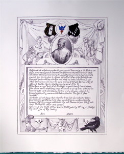
Last year, I worded Davius Saincte-Jacques’ Silver Rapier scroll, with the actual scroll handled by Mistress Nataliia. Since the source I found then was so useful for the OSR, I went back to it when Annys and I received the commission his Golden Rapier scroll. I found what I was looking for in a much earlier letter than the last time, this letter being from Edward IV, rather than Elizabeth I. As it had the feel I was looking for, I fudged the date-accuracy a skosh and ran with it. This text contains most of what I love about good scrolls: it’s overly wordy, contains wonderful spelling, and allowed me to insert several in-jokes tailored to the gentle receiving it.
Text and process images after the jump.
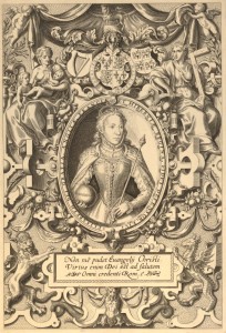
The text was made even more appropriate by finding the right source image. I started looking for 16th-century documents, and eventually widened my search to books (and it’s a good thing I did!). I found several inspirations, including the frontispeice for The Mariner’s Mirror, but I eventually settled on the frontispiece from the 1568 “Bishop’s Bible”.
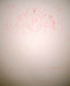
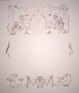
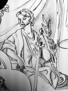
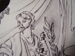
I’ll get the apologies for photo quality out of the way right at the top. Sorry! Ok, moving on! Here’s the third version of my inital sketch (versions one and two will be covered in the “stuff I learned from this project” portion below):
After careful consideration of the original engraving, I decided I wasn’t going to mimic the methods exactly, going instead with ink washes to tone. I’m glad I chose to go that route, because while it isn’t exactly what was in the exemplar, neither was my finished piece going to be engraved, and I had some familiarity with washes. That said… the washes will figure into what I learned, too. Sigh.
Ok, next I laid in the ink work. I tried a few methods for this in my sketches, including Micron pens (nope), and various fountain pens (close, but lacking the line quality I was after), but I went with my Leonart nib, which has a fine enough point to allow me thin thins, but is flexible enough to give me big fat marks when I want them (usually).
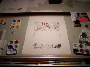
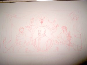
Gratuitous workspace photo, because it makes me happy. So there. Also, you can see my roughs and photo reference for the portrait.
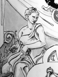
As you can see in the gratuitous workspace image, I moved on to ink washes next, alternating them with laying in gouache for the devices around the portrait.
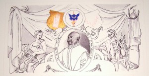
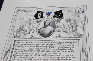
Close up of the top with initial washes and some gouache. The motto is Middle French for “Why you cryin’, girl?”
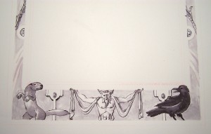
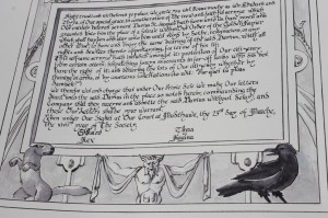
Close up of the bottom. The otter’s an in-joke. Not displeased with this section’s washes, although they worked far better in my sketch tests.
It was at this point that two major flaws in my brainmeats became apparent: First, in my tests, I saw no difference in wash-first-then-linework and linework-first-then-wash. In practice, whooo. The final, on Arches hot press, very much would have preferred me to have laid down the washes first. Second, as you can see by comparing the top section closeup above and the image below, I reversed the tinctures for Davius’ device. I was aiming for black ermine dots on gold, and laid down a nice layer of shell gold for that purpose. Then I second-guessed myself and double-checked the blazon… his field is pean, gold ermine dots on black.
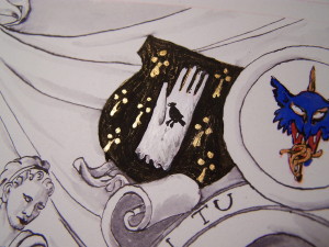
Davius’ device, now corrected. As you can see, while there’s crackling in the black gouache, the end result is a much richer field (what with all the gold under there).
The last part of my work was inking the straight lines, which I was a little worried about. I ended up getting to use the built-in parallel liner on my drafting table and my foam-backed metal rulers for the purpose they were intended, since in concert with the dip pen, they gave me exactly what I was looking for. (I wish I could say the same for my fine-line brush work… that left me a bit unhappy.) All in all, though – mission accomplished. The scroll went out in a mini-court on the fencing list, to good acclaim. Made Davius cry. (Although, truthfully, that’s not hard to do.)
Let’s talk about what I learned from this scroll, shall we?
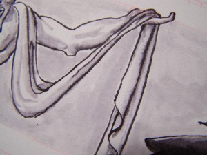
Wash first, ink second. As I mentioned above, my washes vexed me, because the worked so differently from the sketches to the final. There was a lot of bloom in most (but not all, interestingly) of the places where wash crossed the inkwork:
Yes, I know I just checked the blazon… let me check it again, thanks. You would think, since I was the consulting herald for Davius’ name, device, and badge, that I’d remember which field we’d used. You would be wrong, though.
I need more practice making fine lines with a brush. I haven’t yet found a more successful brush than my Mirandola period brush for anything I do scribally. That said, I still can’t trust myself to use the brush to make the tiny, fine marks which I want. This will improve my lamp black outlines, as well as my whitework. Someday! Someday I’ll produce non-hamhanded outlines and whitework, and it will be glorious.
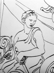
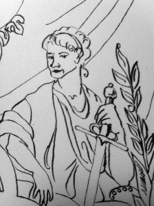
Let it go, man. The portrait looks fine. I am my own worst critic when it comes to drawing faces. I have a degree in drawing. I took four or five life intense drawing classes, along with five drawing classes, and I still hate my work on faces… at least the ones which I need to look like anyone specific.
Commitment equals positive results. Even when my inkwork didn’t go exactly to sketch, I made a big effort to mean every mark I made for this scroll. I feel it shows in the linework, and in many of the wash areas (bloom notwithstanding). It also, I think, saved the outlines from being a total loss even when they went down much heavier than intended.
Annys and I need a better copyshot setup. I know how to photograph art, I’m even trained in how to set up the shot – I used to do that for a living. I lack the lights and a decent digital camera, though, in my personal life. Sigh.
I also learned that I need better bribes for my Muse.
Finally, here’s the final text:
Right trusti and welbeloved populace, we grete you wel. Forasmoche as We, Edward and Thyra, of our special grace, in consideration of the trew and faithful servyce which Our entirely beloved servant Davius St. Jacques hath doon unto Us, have yeven and graunted unto him the place of a felawe within Our Order of the Golden Rapier which shall happen and stay unto him until voyd by dethe, resignacion, or any other wise; to have and enjoy the same bearing of the said Davius, with all rights and dewtees thereto appertayning, for terme of his lif;
This selfsame servyce hath included amongst it: protection of Our citizenry from certain otters; dispatching foreyn miscreants in far-off lands who did not have the right of it; and bettering the lots of Our citizenry wether by training at arms, or by courteous solicitations (to wit: “Pur quei tu plors damisele?”).
We therefor wol and charge that under Our Privie Sele We make Our letters direct unto the said Davius in the place so noted herein; commaunding the Company that they receyve and admitte the said Davius without delay; and these Our Letters shalbe your warrant.
Yeven under our Signet at our court at Mudthawe, the 23rd day of Marche the xlviird year of The Society.
Illumination based on the frontispiece from “The Bishop’s Bible”, 1568. Higgins Eternal and Windsor & Newton gouache on Arches hot press, cut to approx. 11″x17″.
Text based on Signet Letter (English) for the Issue of Letters under the Privy Seal only (20 November, 16 Edward IV) from “A formula book of English official historical documents, Volume 1” By Hubert Hall
