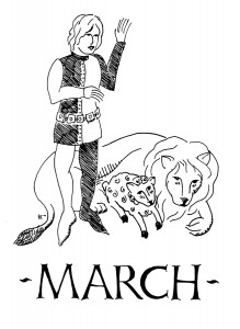
This is the handout for the class on 14th century figure drawing which I taught at Known World Heraldic and Scribal Symposium. For the people who I promised copies of this (at the time, unfinished) document, I apologise. I’ve had some unfortunate Life issues which have kept me from finishing and sending this out. I will send them out… but in the meantime, I’m putting this here so it’s available to the masses.
Category Archives: Print
Compleat Anachronist artwork – Three People at a Table
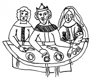
Artwork for the Cover of the Compleat Anachronist, based on “Death of John the Baptist”, from the ninth-century Chartres Gospel (Paris, Bibliotheque Nationale lat. 9386, fol. 146)
The ninth century isn’t usually my style, but in a pinch…
A little drawing done for an upcoming issue of the Compleat Anachronist. I was asked to draw a scene similar to a facsimile of the source material, but leaving out the actual sword-death parts. I executed this in ink on pergamenata, then scanned it and prepped it for publication.
June 2012 Pikestaff cover (April 2012)
If you’re a paid SCA member of the East Kingdom, you may have already seen this somewhere. 🙂
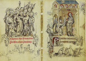
This design sprang from my research for my the 14th century figure drawing class I intend to teach at Known World Heraldic and Scribal Symposium in June. I’ve been looking at examples of illumination and marginalia from the 12th, 13th, 14th, and 15th centuries to break down the styles by basic era, and found that the style I use to draw people is pretty close to the style seen in the later 1300s, but that this style doesn’t go as far towards the 13th c. as I thought. However, I have recently found several examples of the style I was first exposed to as “14th century” art, for example, the Vienna Bohun psalter, in addition to the wonderful example of grisielle (gray work) found in the Hours of Jeanne d’Evreux.
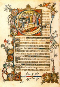
For this cover, I finally decided to work from the Vienna Bohun psalter folio 85, which features a scene of the Israelites after crossing the Red Sea within an enormous illuminated capital. More than this, the people in this image look just like the people I usually draw, the kind of figures my hypothesis was built around. A few leaps of creative logic later, I had the pencil sketch for the cover roughed out, using the capital “P” of Pikestaff as my centerpiece. Sketches and the rest of the process follow the jump.
Cover, Nicole Salomone’s “Forgotten”
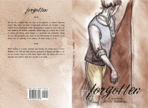
My friend Nicole has been writing a book of historical fiction for several years. She’s into historical dance, and her research ties dance to the social elements of the time (“Why is this dance done this way? Ohhh… in that era, they wore shoes that might only let you move your feet a certain way”, that sort of thing) and more recently, she’s been focusung on her interest in historical medicine. She’s combined a slew of those pursuits into this book, a novella set during the American Revolution. Long ago she commissioned me to illustrate the cover… and, much like John Radburn’s CD cover, the Muse stayed away on this one for a long, long time. This, despite the fact that Nicole had given me a wonderfully thorough write-up of what the cover should show.
For months, I had nothing.
At all. Bupkes mit bupkes. Thankfully, during this time, Nicole was still finishing the book, so I had some leeway.
When inspiration did hit, and it did, it hit well. The final looks very much like the sketches in layout, although it took me a while to figure out what sort of art style the peice demanded (I’m embarrassed by some of my attempts to fight the direction the drawing wanted to go, see the third rough below). Now it was my turn to research: the cover would show a woman dressed in a man’s cast-off military uniform of the time, so I needed good sources for the uniform. Thankfully, Nicole knew what unit the uniform needed to come from, so I was able to find images to work from for accuracy. Also, I know what a canvas tent looks like. Really. Yet it took weeks of poring over images of rev-war tents to make sure I drew what a tent looked like (or in the case of the final art, the suggestion of what a tent looks like.
The hardest part for me was the actual body positioning. I couldn’t get all the parts to work together, and it took a lot out of me to fight with the drawing that much. It didn’t matter if I worked from photos or life, I. Could. Not. Get. The. Pose. To. Work.
Then, when looking at another friend’s pictures of her new kitten, I saw the very part that was key to the whole pose – the perfect turn of head and shoulder. That was it, the rest fell into place quickly after that. (Incidentally, that friend is happy for Nicole that the book is now published, but more happy that her head is on it.)
And now, the book is now published and a reality! “Forgotten” is available on Amazon, both here and abroad. If you like well-researched historical fiction, complete with no-way-they-couldn’t-have-thought-that-was-good-for-you 18th century field medicine, go buy a copy or two!
Process sketches are after the jump.
Cover for Jon Radburn CD, “Songs for Dead Singers”
This is a project which has been back-burnered for several summers. It isn’t, strictly speaking, SCA-related, but as I know Jon through the SCA, and it’s current work, it’s going up here.
Jon spoke to me several years ago about doing some graphics work for his web presence and his then-just-an-idea album. We discussed some of the questions I like to have answered when I start a creative project, and then both promptly got busy. We’ve remained in touch on and off about this, but this past winter Jon got several of his ducks in a row and was nearing actually having an album for which he would need a cover and some web marketing, so he asked me to put it back on a front burner.
March 2011 Pikestaff cover (January 2011)
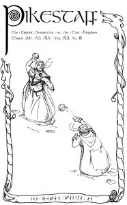
More art for the Pikestaff! I’ve now done two covers, both for the month of March, six years apart. I’m told that I could, if I chose, “own” the March cover. This amuses me. (Of course, this becomes academic should the print edition of the newsletter go the way of the dodo, as it could due to budget cuts and pressure to move to electronic distibution.)
I chose a Norse winter theme this time, based around an image I had in my sketchbook of my wife and my older daughter, arrayed in all their naalbound viking finery, engaged in a snowball fight. From there, I created several small art bits to use for filling space.
My inspiration for all of this was initially the sketch (after the jump), but while researching the extra drawings, I became intrigued by the concept of viking graffitti, particularly that found in the burial mound at Maeshowe, Orkney. The runes at the bottom, which read, “Ian Raven painted me”, are based on the runic writing found in that mound, remnants of a 12th century break-in by a band of vikings seeking shelter from a snowstorm. The border around the cover image draws from several standing stones found in Gotland (an island county in Sweden). The oar is copied from an extant longship find, and the carved wooden bear and the comb are drawn from memory of when I studied vikings as a youngster. The runes (the letters f and o, for no other reason than that I liked them) are based on a set I made in college, which in turn were based on a set I studied at the time.
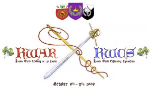
2009 Known World Academy of the Rapier/Known World Costuming Symposium website and swag art
I built and co-maintained the website for KWAR/KWCS 2009, designing it to look as if it had been illuminated and painted. This was a pretty decent challenge, as I’m not a painter, and this was going on the web. The base images are ink drawings, digitally painted in Photoshop. Once we had the site laid out, I designed the image which would eventually grace the event swag (see above.) This was produced on-demand at Zazzle.com.
The real site is long gone, but here’s the sample site. Unfortunately, it looks like the “penguin cam” link is dead too, but I keep holding out hope.
EDIT: Wonder of wonders! The penguin cam is working again! Life is the tiniest bit better today because of it.

