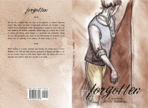
My friend Nicole has been writing a book of historical fiction for several years. She’s into historical dance, and her research ties dance to the social elements of the time (“Why is this dance done this way? Ohhh… in that era, they wore shoes that might only let you move your feet a certain way”, that sort of thing) and more recently, she’s been focusung on her interest in historical medicine. She’s combined a slew of those pursuits into this book, a novella set during the American Revolution. Long ago she commissioned me to illustrate the cover… and, much like John Radburn’s CD cover, the Muse stayed away on this one for a long, long time. This, despite the fact that Nicole had given me a wonderfully thorough write-up of what the cover should show.
For months, I had nothing.
At all. Bupkes mit bupkes. Thankfully, during this time, Nicole was still finishing the book, so I had some leeway.
When inspiration did hit, and it did, it hit well. The final looks very much like the sketches in layout, although it took me a while to figure out what sort of art style the peice demanded (I’m embarrassed by some of my attempts to fight the direction the drawing wanted to go, see the third rough below). Now it was my turn to research: the cover would show a woman dressed in a man’s cast-off military uniform of the time, so I needed good sources for the uniform. Thankfully, Nicole knew what unit the uniform needed to come from, so I was able to find images to work from for accuracy. Also, I know what a canvas tent looks like. Really. Yet it took weeks of poring over images of rev-war tents to make sure I drew what a tent looked like (or in the case of the final art, the suggestion of what a tent looks like.
The hardest part for me was the actual body positioning. I couldn’t get all the parts to work together, and it took a lot out of me to fight with the drawing that much. It didn’t matter if I worked from photos or life, I. Could. Not. Get. The. Pose. To. Work.
Then, when looking at another friend’s pictures of her new kitten, I saw the very part that was key to the whole pose – the perfect turn of head and shoulder. That was it, the rest fell into place quickly after that. (Incidentally, that friend is happy for Nicole that the book is now published, but more happy that her head is on it.)
And now, the book is now published and a reality! “Forgotten” is available on Amazon, both here and abroad. If you like well-researched historical fiction, complete with no-way-they-couldn’t-have-thought-that-was-good-for-you 18th century field medicine, go buy a copy or two!
Process sketches are after the jump.


